Character creation UI
The task
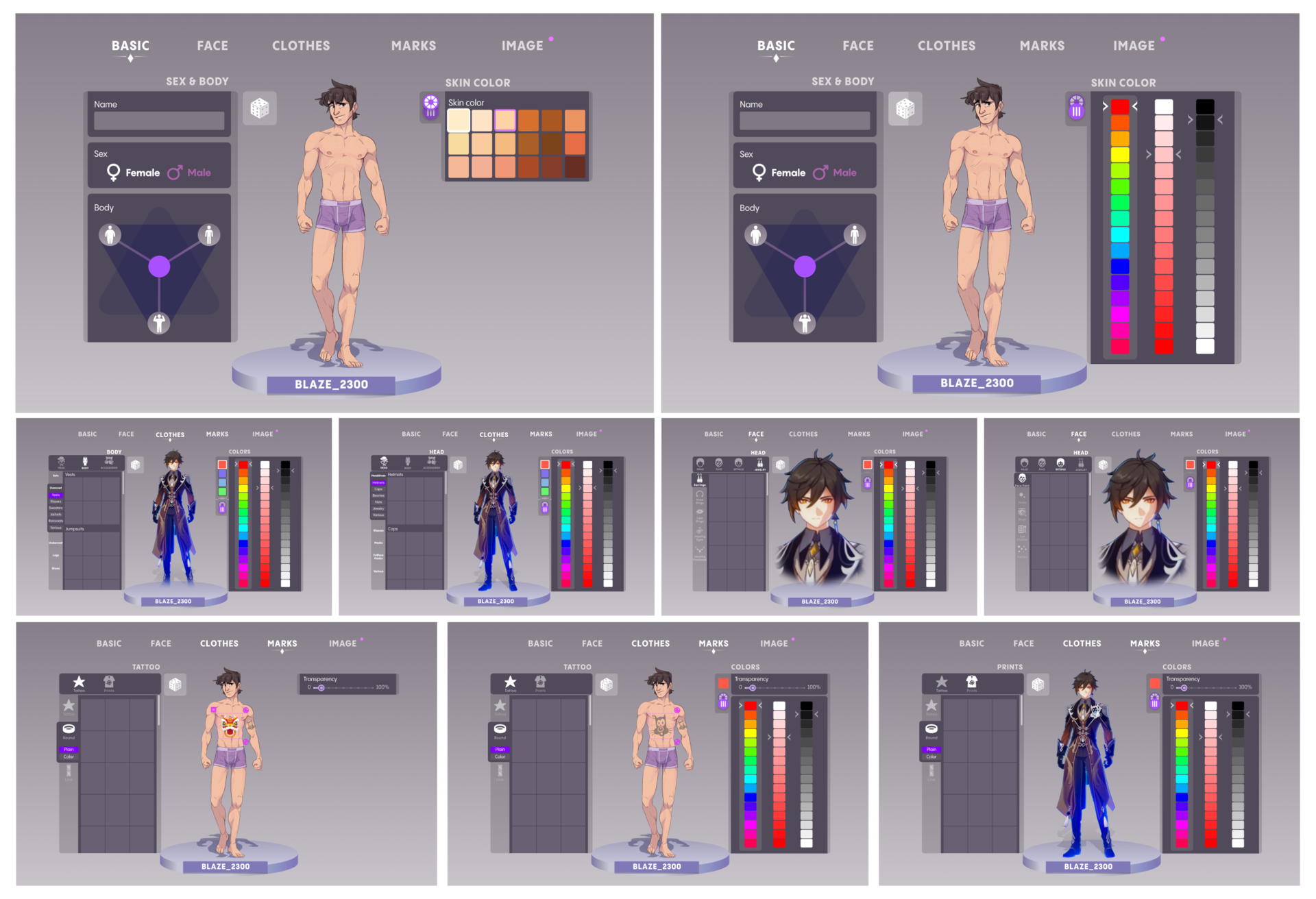
We were asked to do a review and, if possible, optimize the character creation process. The initial client's wireframes contained a number of UI errors and inconsistencies, and could indeed be improved with relatively simple methods

1. Navigational patterns
A quick analysis shows that at least 4 different UI patterns are used for navigation. This, among other things, makes the UI complicated and cluttered.
PROBLEM
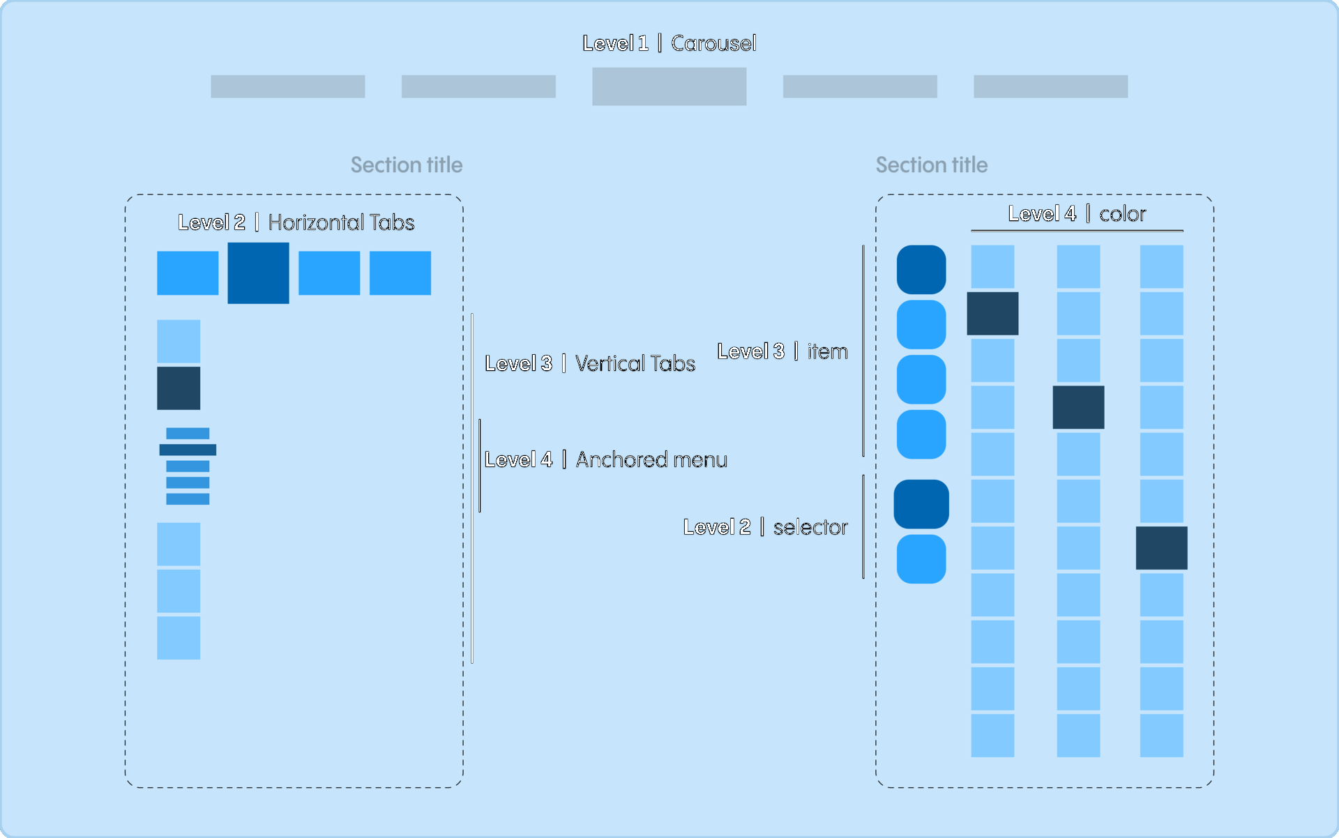

Consolidate multiple navigation patterns into one. But one that works everywhere and can withstand end-to-end scaling
SOLUTION
2. Overcomplicated UI controls
Poor choice of mechanics results in a counter-intuitive interface even for simple body type selection.
PROBLEM
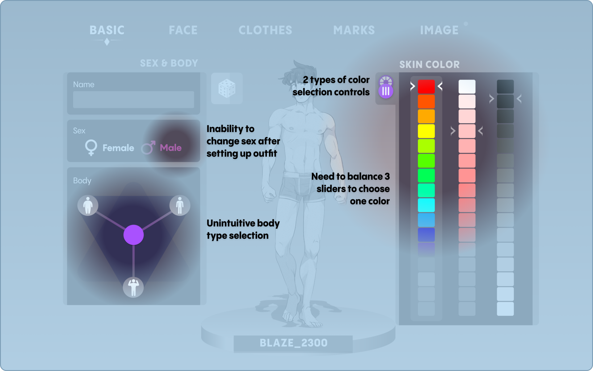

Show preview for body types; limit available colors to a finite number of presets; move the gender change to the outer loop so that it can be changed at any stage of a character's setup.
SOLUTION
Improved wireframes
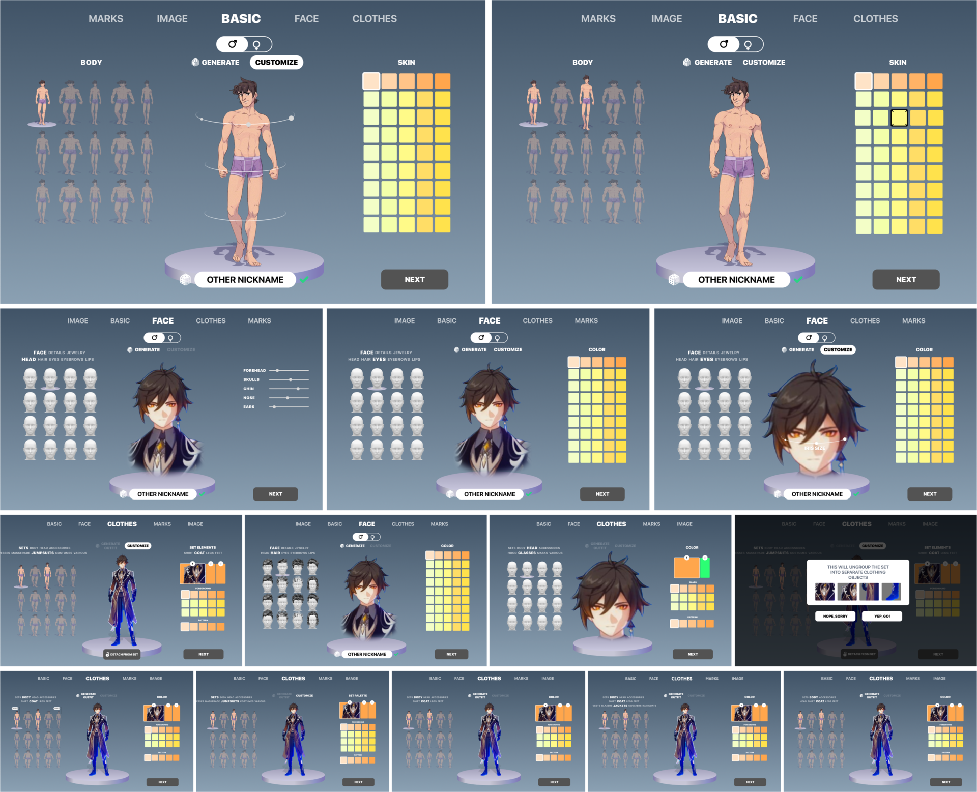

Design implementation I
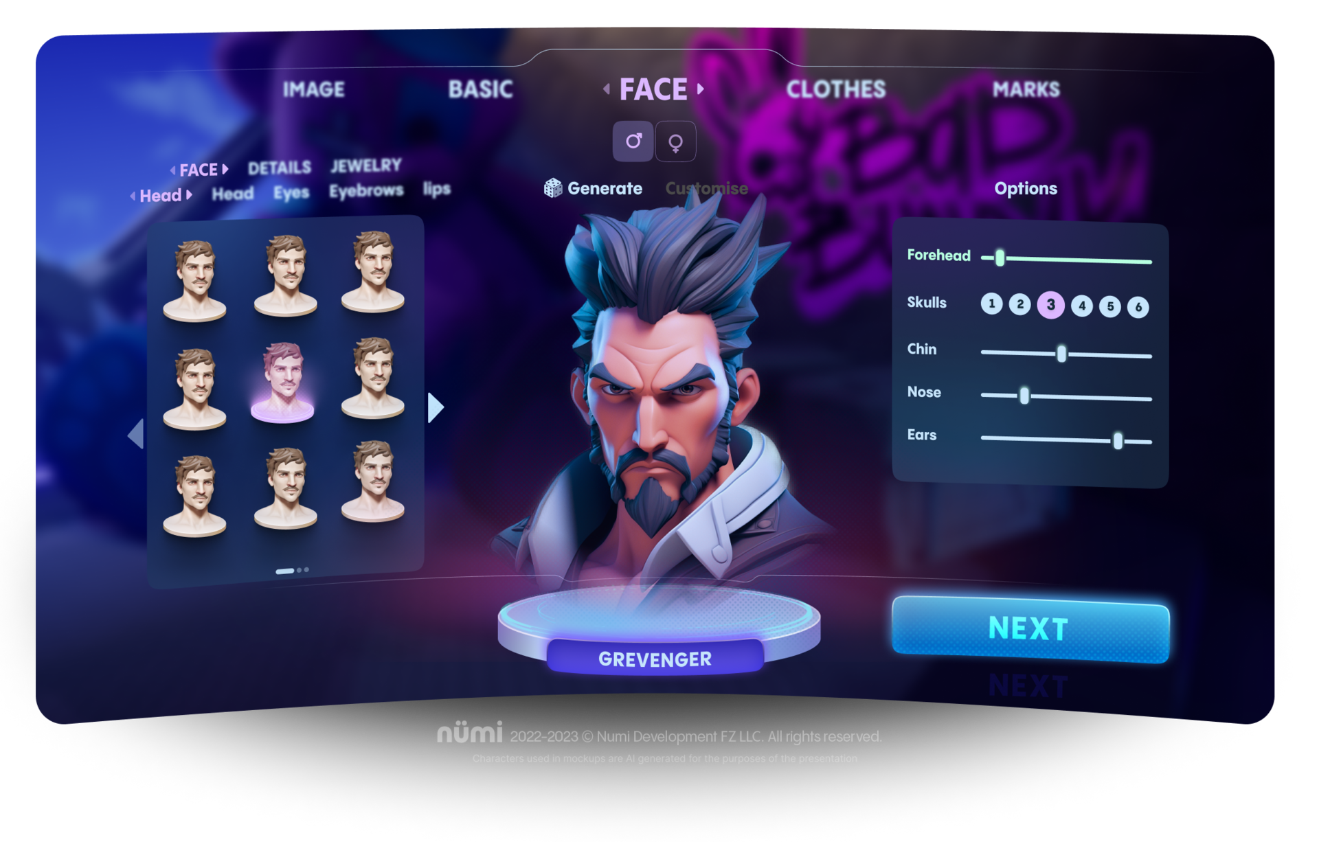
First, we try to improve the client's design with a few simple techniques: tone down flickering colors; improve typography and hierarchy; strengthen visual accents.
INITIAL UI DESIGN IMPROVEMENTS
These improvements, which are purely visual and do not require extensive development, go a long way toward reducing visual noise and improving readability.
Design implementation II
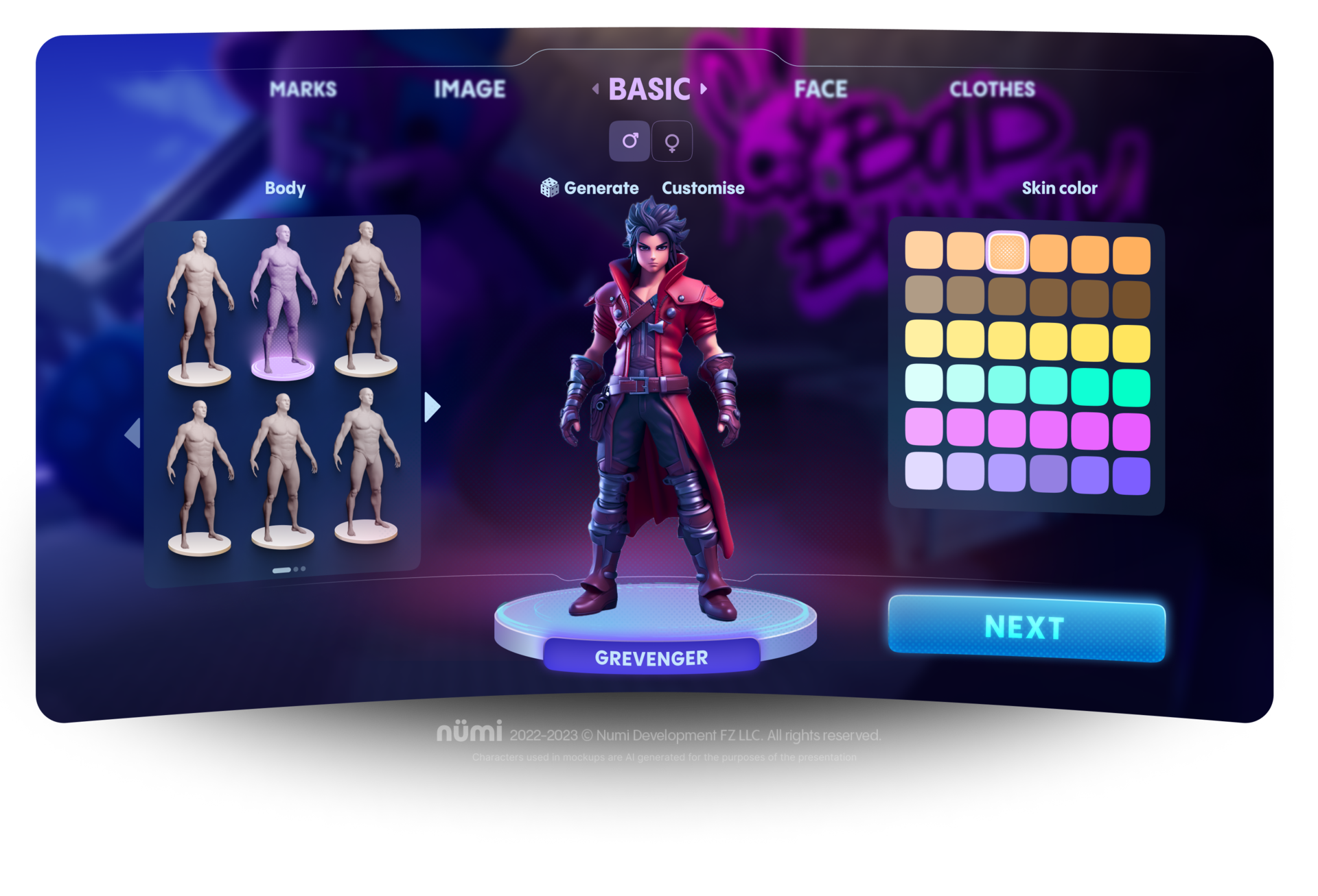
1. Unified UI navigational pattern
2. Unified UI color pattern for BASE-FOCUS-SELECTED elements
3. Visual accents & hierarchy
PRINICPLES TO BUILD UPON

BASE COLOR
SELECTED
FOCUS
CHOOSE BODY TYPE AND COLOR
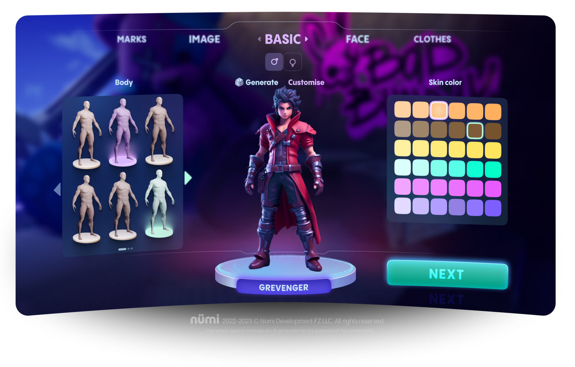
TUNE BODY SHAPE
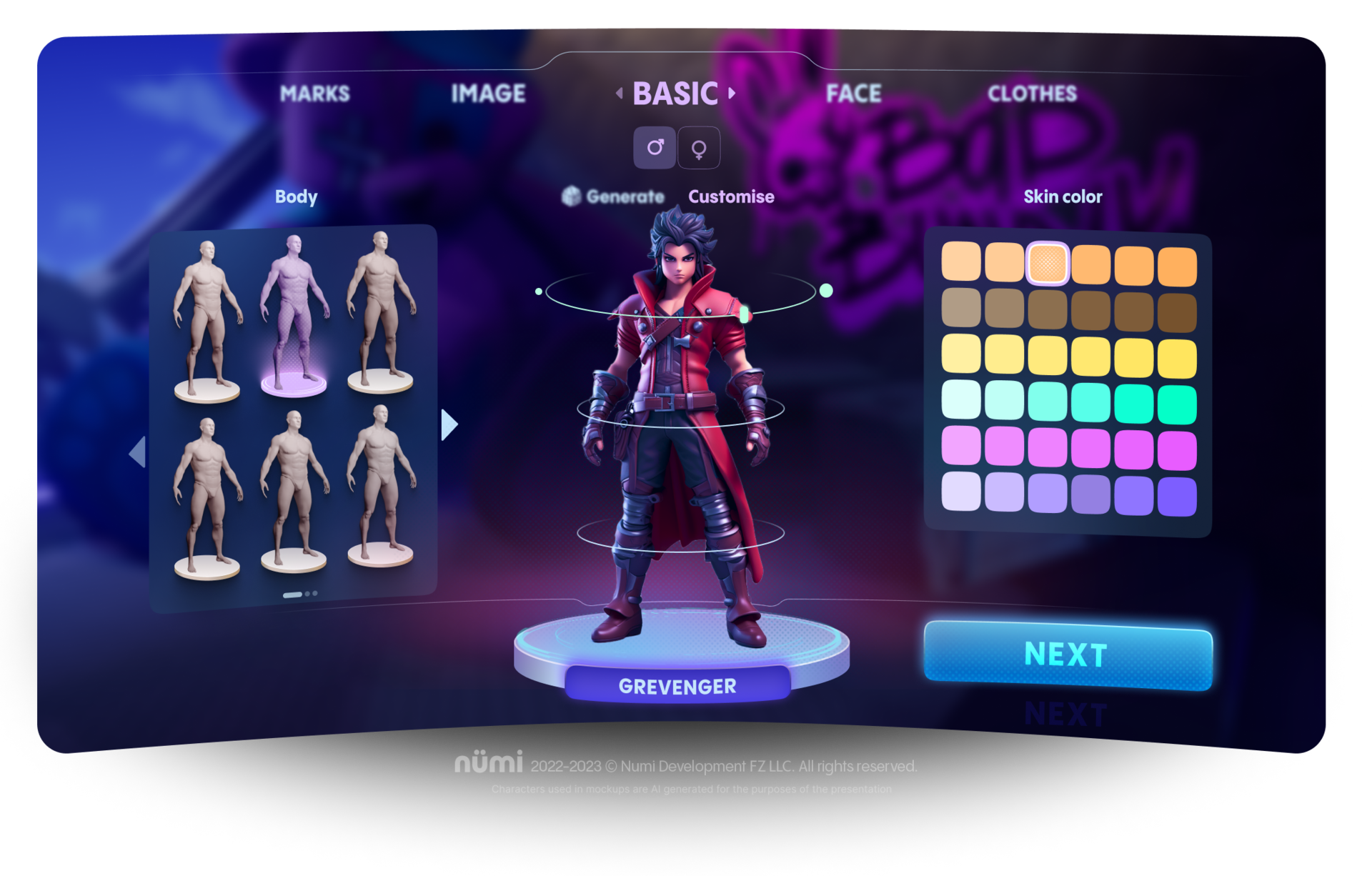
SET UP CLOTHES
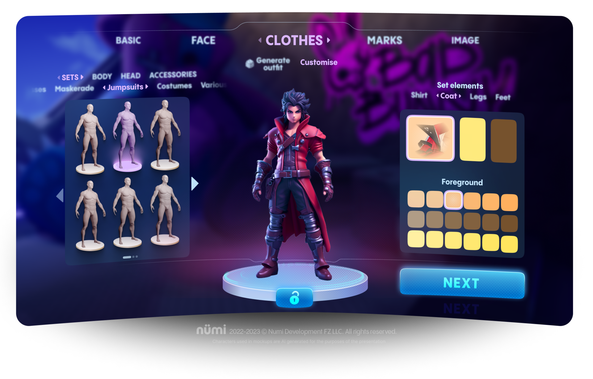
CHOOSE HEAD TYPE
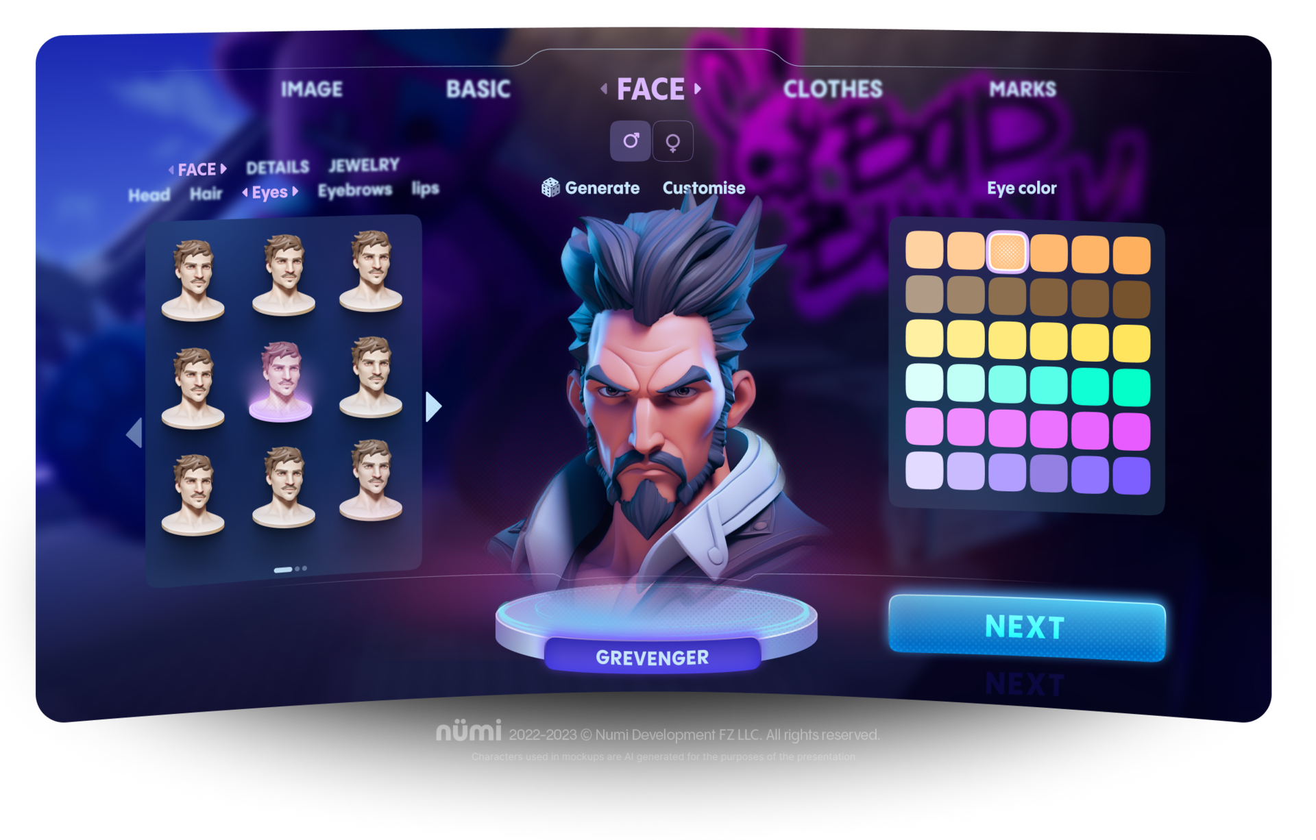
FINE TUNING
