Logo & Branding


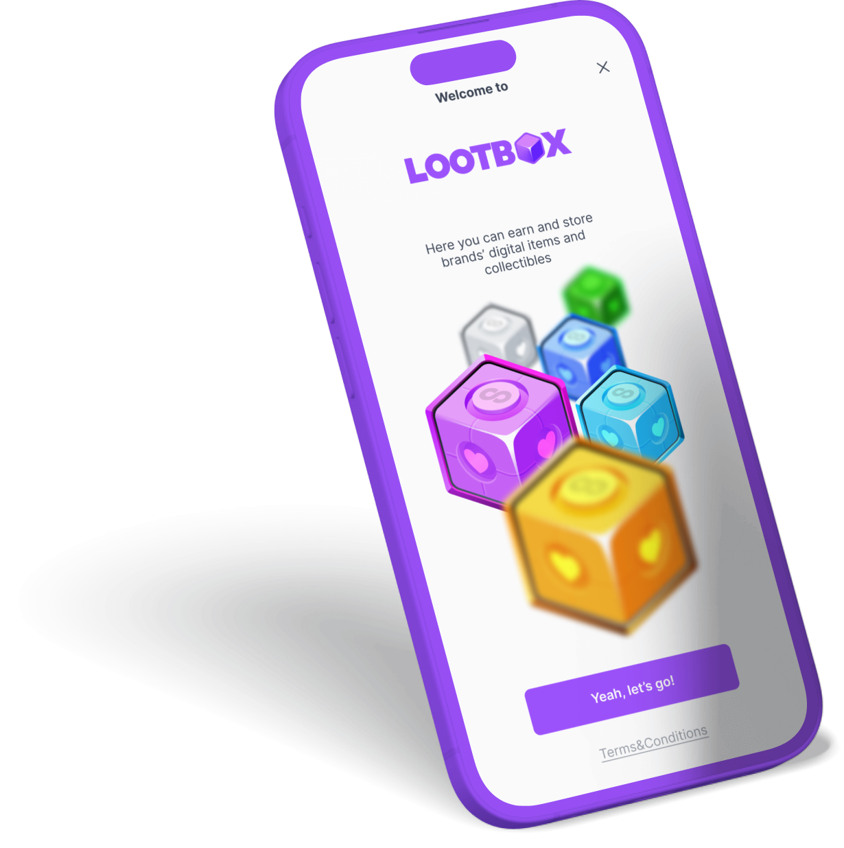
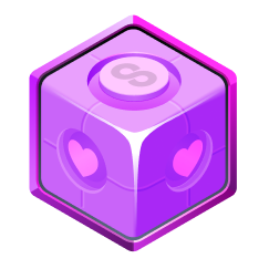
If the whole app is based around looting boxes, then why not build the whole branding around it?
The idea is the logo
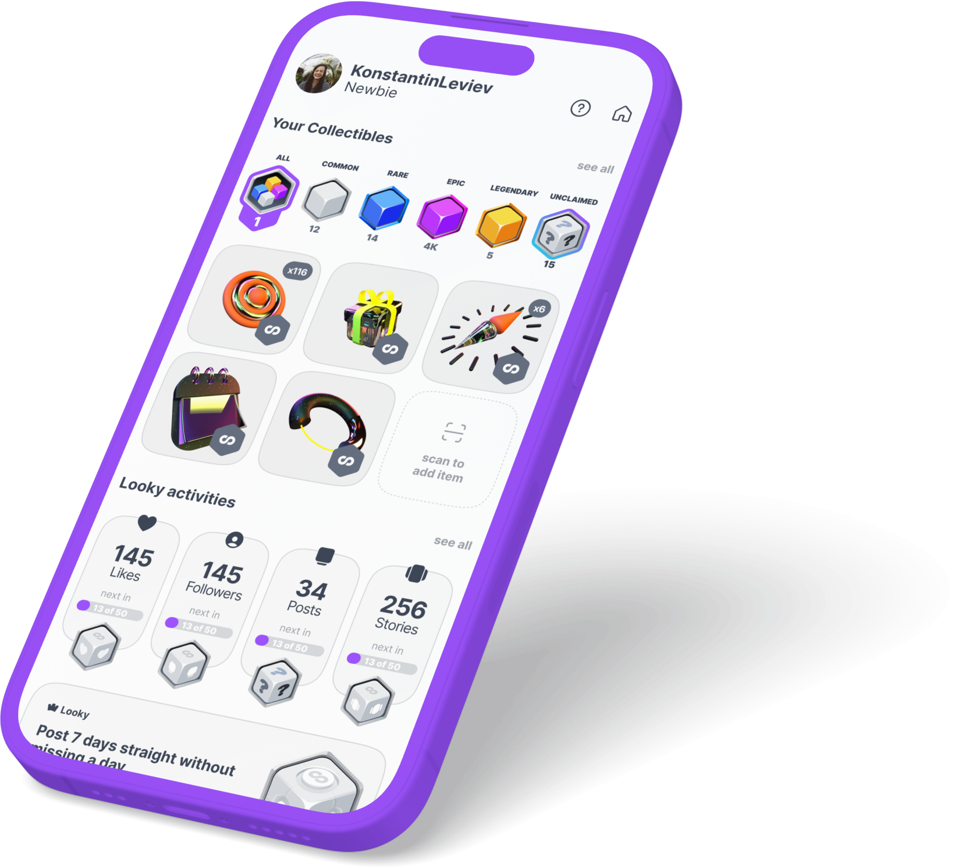
The app
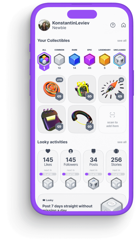

Activities like reading or posting stories om social media apps, reacting to brand's posts etc help user obtain valuable digital collectibles
Much like fitness apps, on Lootbox brands reward users for daily routine social activities
Lootboxes
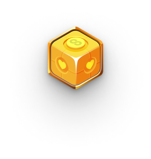
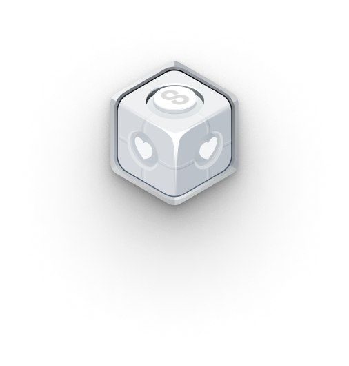
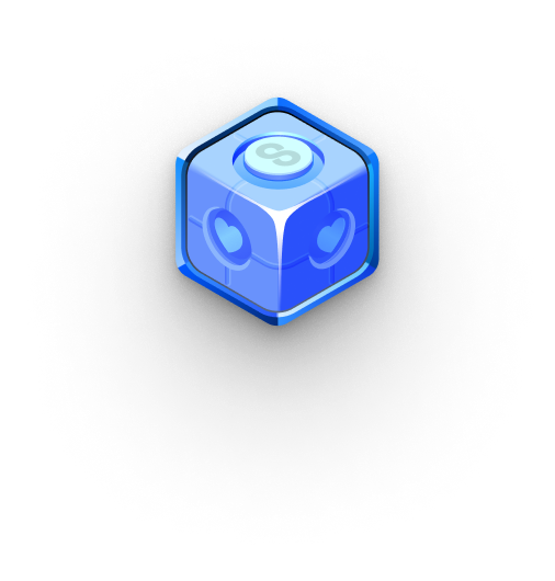
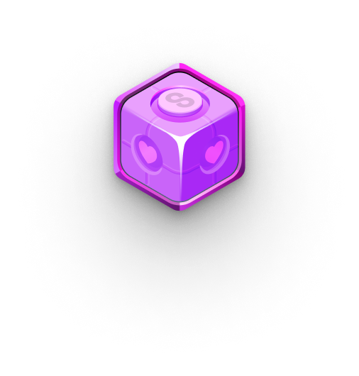
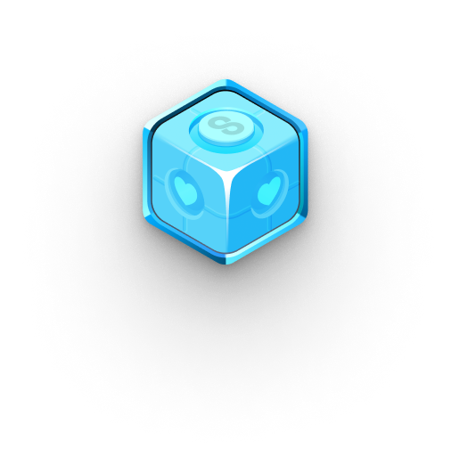
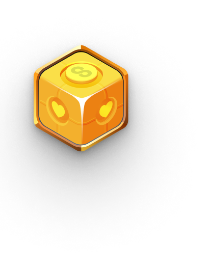
4 types of boxes inherit rarity system familiar to all gamers: Common, Rare, Epic and Legendary, and extremely rare Diamond
Every box is designed to feel physical and avluable
Brands & Challenges
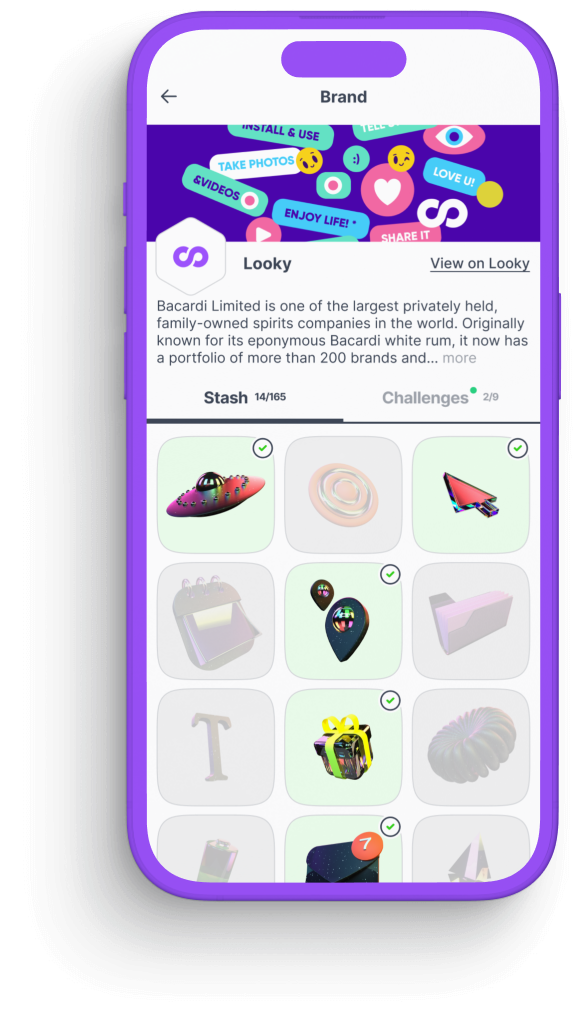
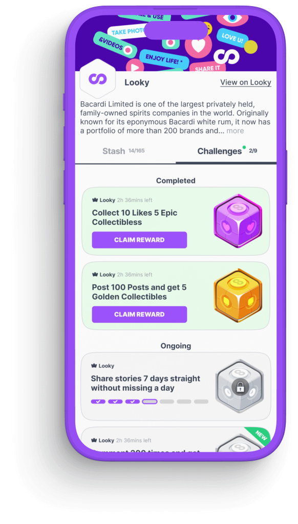
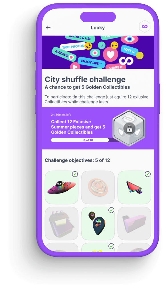

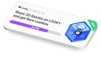

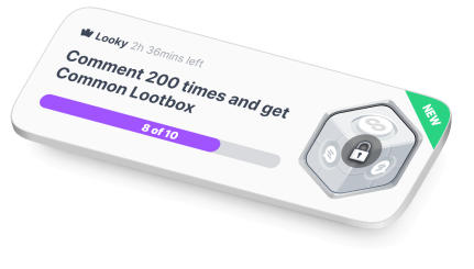
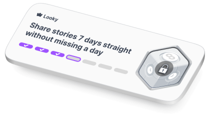
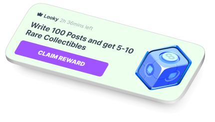
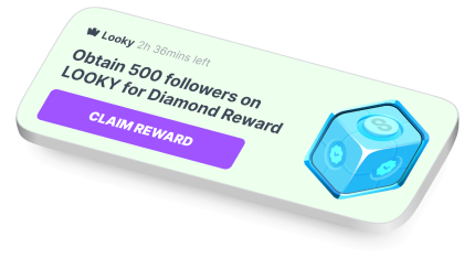

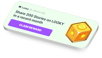


Here users can have a look at full brand's stash of collectibles and get the idea about all the challenges
Every brand has it's own profile page on Lootbox
Challenges can be of various of types: to like posts, to perform one action, series of actions, or to perform actions consequentialy
Flexible challenge blocks
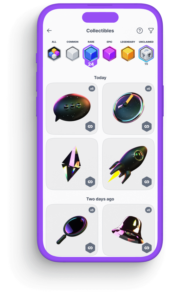
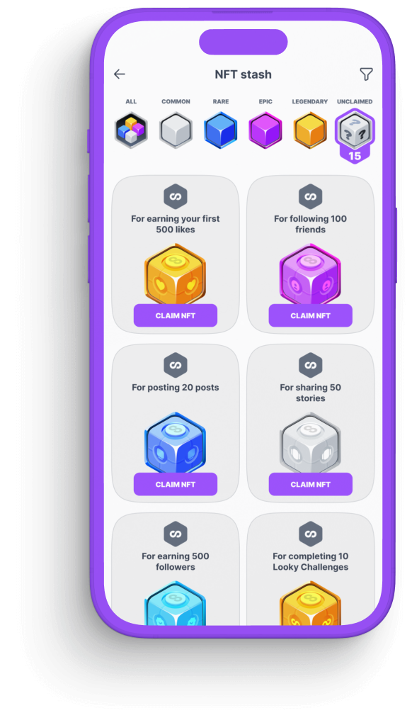
Each challenge brings user a Lootbox, which contains a digital collectible badge
Completing challenges is rewarded
Intro & onboarding
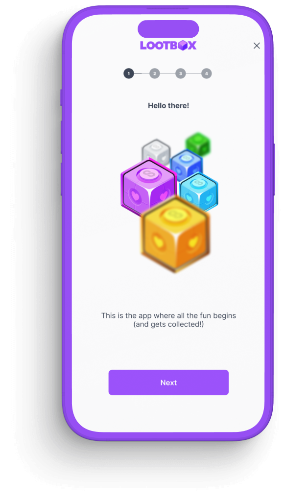
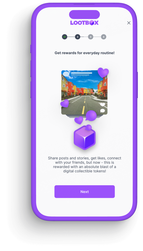
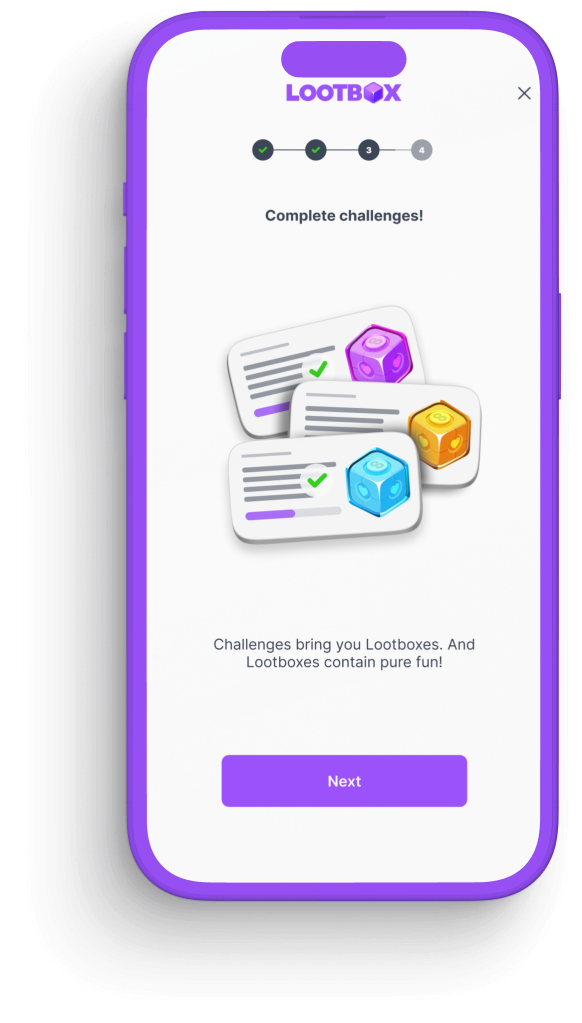
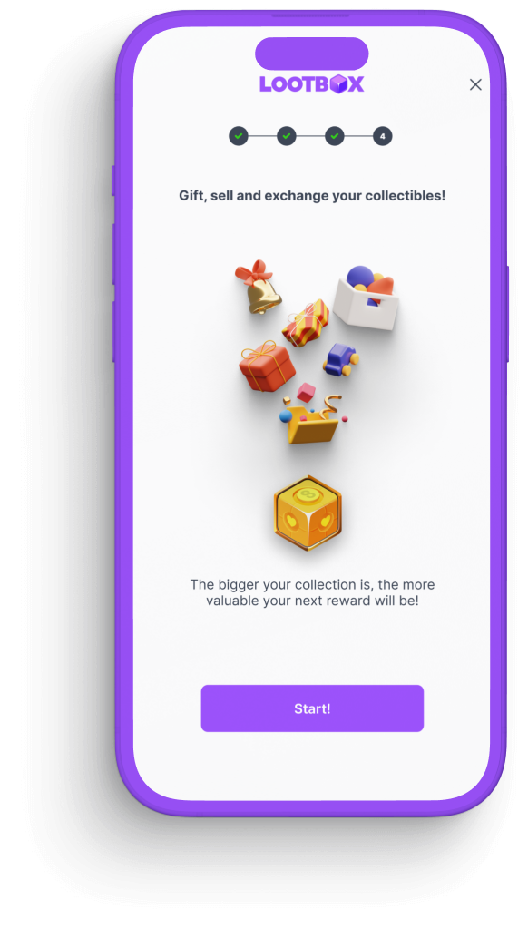
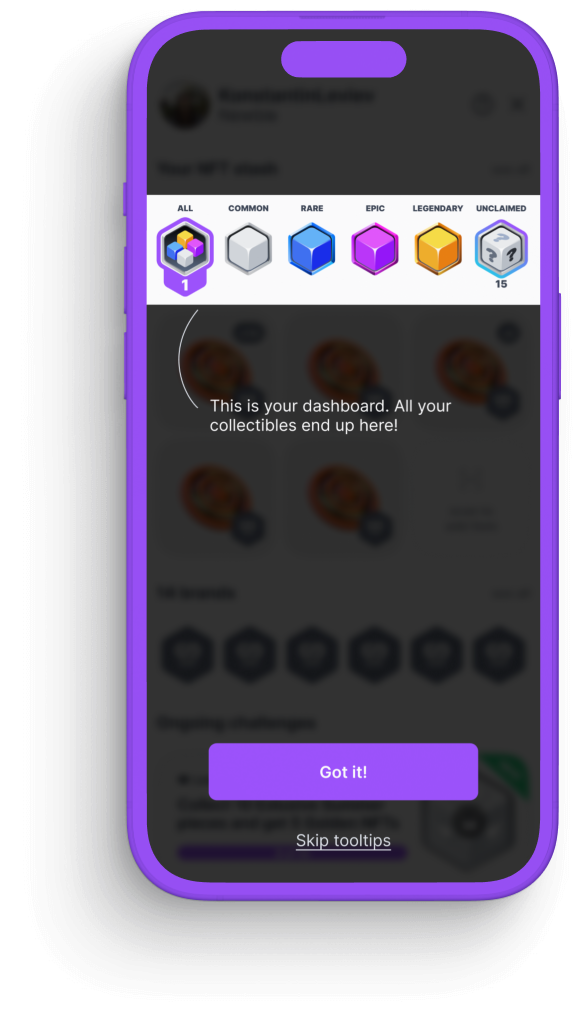
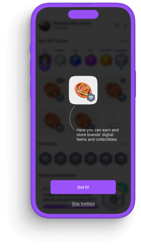
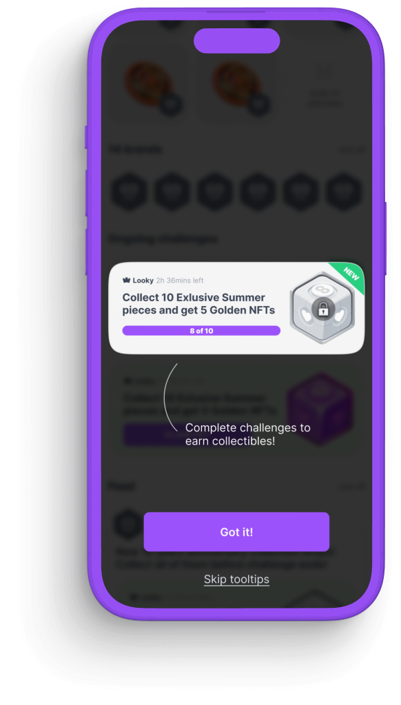
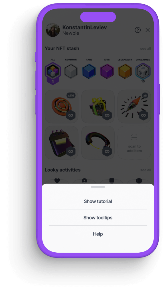
Explaining what this all is about and revealing the main goals and means to achieve it
Introduction screens
To familiarize user with the dashboard layout and re
And elemen-by-element tooltips on first start
Design system underneath
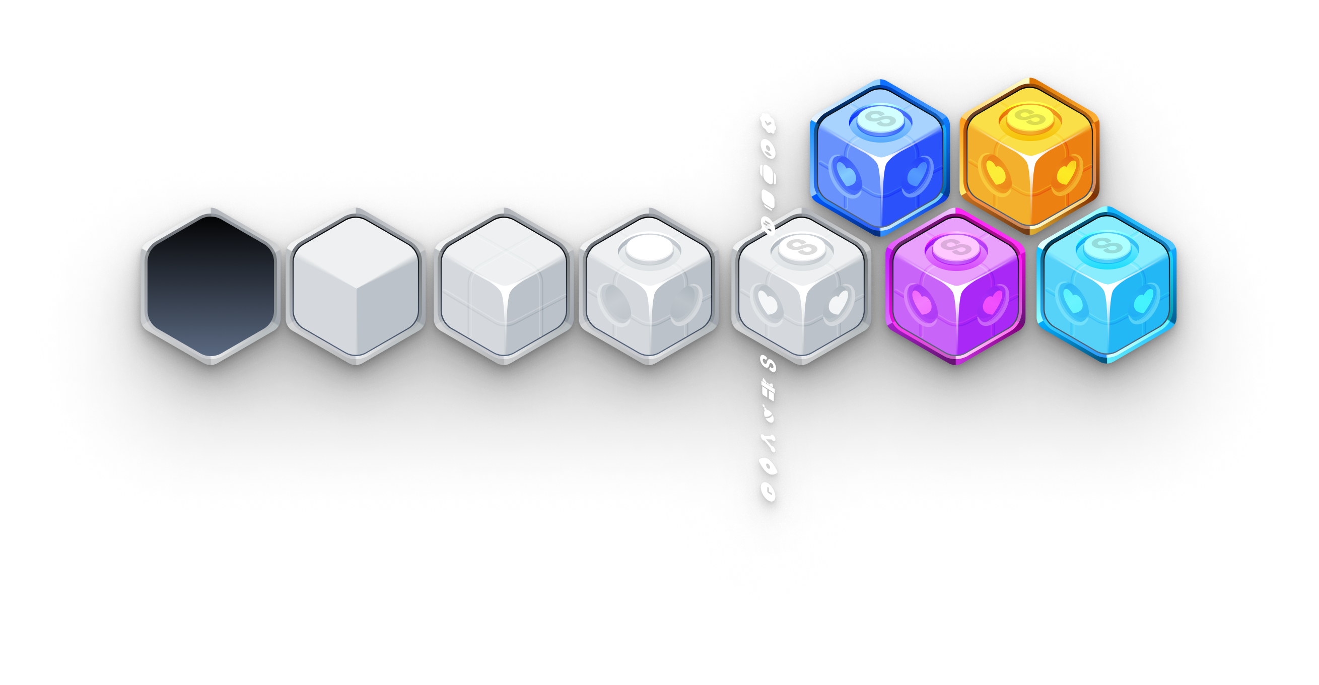


4
rarity
grades
grades
3
types of complexity
1
ultra rare
diamond cube
diamond cube
Side icons for every case
Pop-ups, sorting and other tech screens
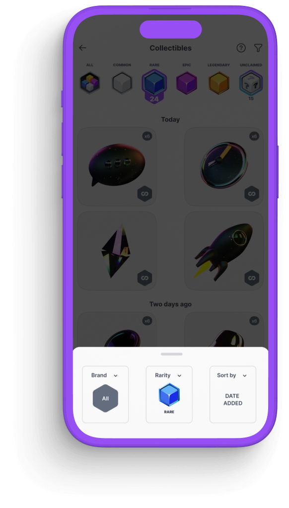
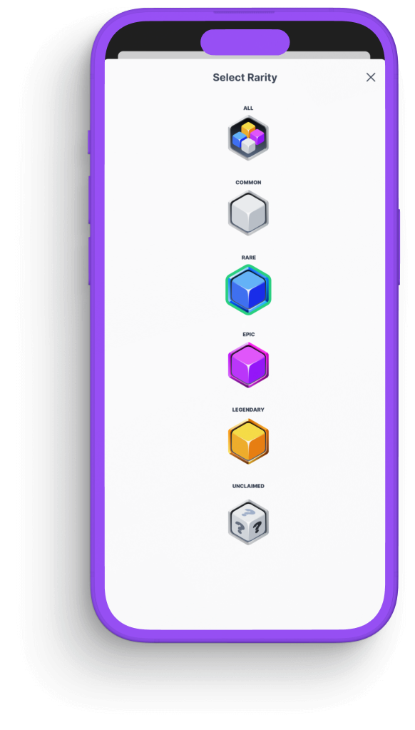
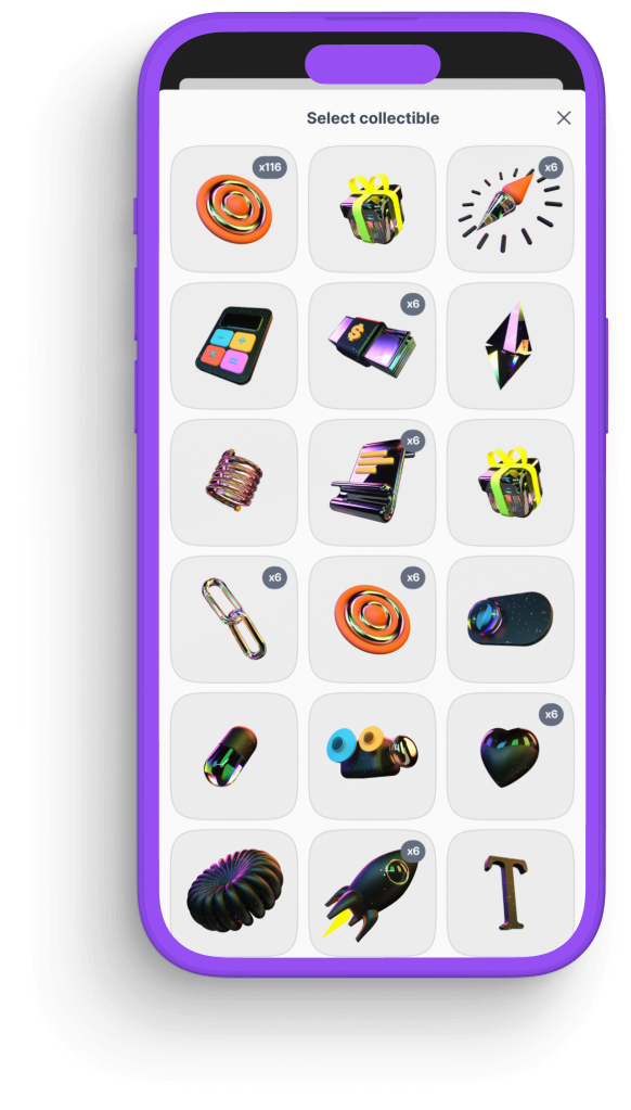
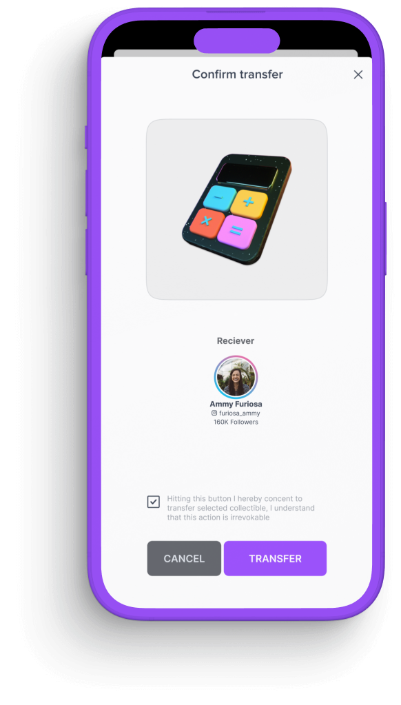
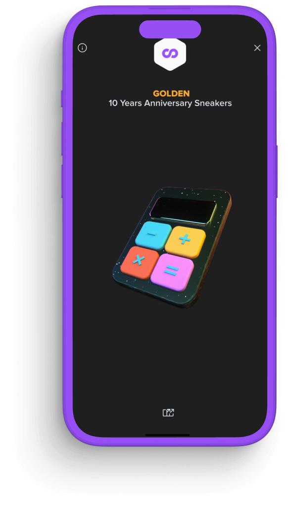
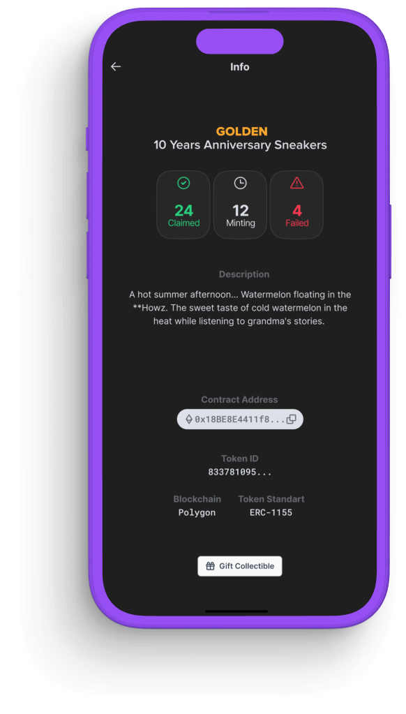
For every state, every action and every possible outcome
Merely 56 screens designed
Going dark


Thanks for reading this far! If it's not too much trouble - hit those like buttons down below, or hey! - even share or retweet this!
Dark mode rules!


